Showing posts with label data science. Show all posts

Wednesday, March 13, 2024

Recurring Revenue Modeling Can Be Tricky, Using Cancellation Curves Can Improve Precision And Results

 In a recent post on recurring revenue financial modeling, I covered some of the main drivers that play a role in the construction of financial forecasts for SaaS and related business models. One of the most important aspects of such financial forecasts is the build out of contracted revenues. In general contracted revenues can be quite predictable, which makes the recurring revenue model so attractive to investors.

The Basics

In a basic format, the recurring revenue forecasting for a good financial model will have the following components to calculate the monthly revenue:

  1. Average revenue per subscriber

  2. Number of subscribers, beginning of the month (past bookings)

  3. Number of subscribers added in the month (new bookings)

  4. Composite cancellation rate (the expected % of existing subscribers who will cancel in the month)

  5. Number of subscribers lost in the month (2*4, cancellations or churn)

  6. Net number of subscribers (2+3-5)

  7. Revenue for the month (1*6)

The image below shows a recurring revenue forecast based on the above calculations. It is necessary to understand that in this kind of model, the limited variations in average revenue and cancellation rates lend themselves to a composite view of the revenue build. If these underlying simplifications are reliable, the above methodology works just fine.

Salvatore Tirabassi
Pro-tip: Unless you have some strong need, I allow subscribers to be calculated in fractions and avoid any rounding functions for subscriber counts. I find partial clients (even though there is no such thing) makes models easier to manage because rounding functions sometimes have unintended consequences and also require maintenance and awareness of their use when other people are using your model.

More complex subscriber calculations

But, what if average revenue per subscriber changes for each new cohort of subscribers and the cancellations vary based on the age of the client. In this case, the value of the existing contracted backlog and the forecast of future contracted backlog becomes much more complex. You can stick to the above methodology, but with cancellations being age dependent, you could be in for hidden surprises and also leave your operations teams with a less refined set of objectives when they are trying to reduce cancellations.

One way to resolve this complexity is to look at a cohort-based backlog, which accounts for the average revenue variation by specifically assigning a revenue amount to a cohort and also assigning a cancellation percentage to each cohort based on its age. In this kind of model, each cohort is assigned a date of birth (sometimes called a vintage) so that it can be tracked uniquely throughout time.

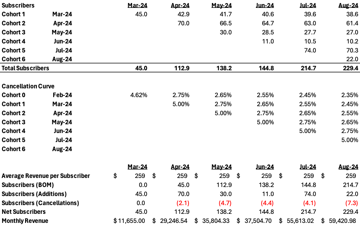
The image below shows what the cancellations would look like in a cohort-based format. (I am intentionally ignoring revenue variations, but this would use a similar methodology to accommodate that variation.) Notice how each month of the model needs to have a cancellation percentage for each cohort.

Salvatore Tirabassi

Compared to the basic format at the beginning of this post, the cohort-based format has turned into a matrix instead of being a single vector (line) of the spreadsheet. In fact, to do this precisely, each line of the basic format should become a matrix. Then instead of multiplying lines in Excel, you multiply across matrices to get to revenue.

Using rough math, the composite cancellation rate in the matrix is about 3% over the March to August time frame. However, you can see that the Aug-24 ending revenues in the cohort-based format ($59,420) are slightly lower than the basic format ($60,120). Now you might think that the $700 (1.1%) is not a big deal, but over time and with increased volume this variance will grow and lead to weaker forecasting. While I would love to use a simpler model for expediency, it does not stand to scrutiny when you want to have reliable forecasting of revenues.

Summary

Tracking recurring revenues is tricky and precision comes with model complexity. I find that the complexity is worth it because it instills confidence in your audiences over time and also provides the operations teams with very specific data about handling the execution on their end. For example, in the cohort-based format above, but not shown here, I would easily provide a forecasted cancellation count by age of the subscriber, which enables the operations team to manage their targets very specifically during the subscriber lifecycle journey.

One final note: this post only deals with the build up of subscribers in the future. If you have existing subscribers, you can use the same methodology but you should not mix the existing cohorts with the projected ones. The matrices go in different directions and they are hard to combine. Manage them in separate files if needed. I hope to do a post on that in the future.

FAQs for Recurring Revenue Modeling using Cohorts:

1. Why is cohort-based forecasting important in recurring revenue modeling?Cohort-based forecasting is crucial in recurring revenue modeling because it allows for a more accurate representation of revenue streams by considering variations in average revenue per subscriber and cancellation rates based on the age of the client cohorts. This approach provides a more granular and precise understanding of revenue projections, enabling better decision-making and operational strategies.

2. How does cohort-based forecasting differ from basic recurring revenue modeling?In basic recurring revenue modeling, calculations are simplified by using composite averages for revenue per subscriber and cancellation rates. In contrast, cohort-based forecasting assigns specific revenue amounts and cancellation percentages to each cohort based on their unique characteristics, such as date of birth or vintage. This results in a more detailed and nuanced analysis of revenue trends over time.

3. What are the benefits of using cohort-based forecasting in revenue modeling?Utilizing cohort-based forecasting in revenue modeling offers several advantages, including enhanced accuracy in predicting revenue fluctuations, better insights into subscriber behavior over time, and the ability to provide operations teams with specific data to optimize customer retention strategies. While this approach may introduce complexity, the precision it brings to forecasting can lead to more reliable financial projections and improved operational efficiency.

Wednesday, February 21, 2024

How We Replaced an Implementation of Workday Adaptive Planning Enterprise Management with Microsoft’s PowerBI Tailored for FP&A Reporting

Excel’s powerful capabilities, integrations and flexibility make it a favored tool for all financial and accounting professionals. Like many middle market companies, we considered moving from an Excel dominated financial planning and reporting process to an “enterprise grade” solution. A very difficult decision, we set aside Excel for a unified financial planning tool, also known as Enterprise Planning Management (EPM) systems.

Salvatore Tirabassi

After a review of solutions and recommendations, we decided to move our financial planning to Workday’s Adaptive Planning (WAP). Our financial forecast in Excel is a complete system: It handles recurring revenue waterfalls, consolidations by products and business units, eliminations between business units, balance sheet forecasting, among other complexities. Nevertheless, the transition, despite a good plan on paper, became never ending.

We faced two core problems, which we thought we could overcome. First, the precision and complexity of our Excel forecasting model was hard to replicate in WAP. Second, our lack of deep knowledge in WAP modeling, forced heavy reliance on consultants and a time-consuming iterative process to make any headway.  To minimize the obstacles and make some use of WAP, we paused our forecasting transition efforts and focused on WAP as a reporting tool. We had modest success, but we ended up having a hodge-podge system of exceptions and frequent error checking that was worse than the status quo.

During this failed transition period, the analytics team, which is part of our finance team, dramatically increased its expertise and capabilities in PowerBI. (While I am going to focus on PowerBI, I encourage the finance pros reading this to think about this solution using whatever business intelligence platform that is available. This should work with any BI platform.) PowerBI’s integrations with Excel and our accounting system (Microsoft NAV) provided the light-bulb moment for moving forward with an in-house automated financial reporting system connecting our Excel forecasts to accounting results and producing polished reporting in real-time.

In order to get there, we assigned a skilled data analyst to work directly with accounting and FP&A to create an ETL (extract, transform and load) template in PowerBI that could take our GL-coded accounting records and match them to financial reports that were business friendly and consistent with our forecasting templates. Here are the key success criteria that made this possible.

  1. Our data analyst had PowerBI, SQL skills needed for the entire buildout.

  2. We were lucky that our data analyst also had solid accounting/finance knowledge to work directly with FP&A and accounting teammates. However, this could have been another team member working in tandem.

  3. The financial reporting templates were already matched to our excel forecasting outputs. This line-for-line matching eliminated the need for another ETL template, but that could have been created if necessary.

  4. Our data analyst spent time mapping GL codes to our financial reporting templates. Without this, the ETL development would have been impossible.

  5. In addition, the data analyst methodically mapped our eliminations entries between subsidiaries and hierarchical entities.

  6. Then, it was time for record matching so that financial reporting template, forecast and GL Codes could be connected in sample data with a clear line of sight to each other.

  7. Finally, the ETL template was ready to be programmed and tested.

  8. PowerBI reporting dashboards were then developed and tested with initial data flows. Here the finance team compared PowerBI financial reports to our previous reports. Checking for accuracy at the line-item, subtotal, and total levels. Any errors were traced all the way back to GL-codes to ensure the fixes could be implemented in the ETL template.'

  9. We then iterated step 8 until multiple periods showed no errors and everything tied out to the most important GL line items such as net income, fixed assets, total revenue, cash balance in every grouping variation we needed (e.g., consolidated, product, business unit, geography, etc.).

The above process took about 120 days to get through Step 8 and then another 60 days (2 reporting cycles) to get through Step 9. All of this was achieved with one resource dedicated to the project and all other FP&A and accounting teammates being on call as needed.

With our financial reporting now published in an automated way, we have dramatically reduced the processing time and eliminated exceptions handling for information flows from accounting to financial reporting. While the EPM also promised financial modeling automations, we never went back to that. Instead, we have improved our Excel-based forecasting models in ways that would be hard to replicate in a new system given the resources we have and the connections of these models to our PowerBI reporting system.

If you are considering an EPM, especially for reporting, it might be worth looking at your existing business intelligence platform for an easier and more manageable solution.

Reference: https://salvatoretirabassi.substack.com/p/how-we-replaced-an-implementation


Wednesday, February 14, 2024

Cracks in Consumer Credit Card Delinquency Despite High Cash Balances

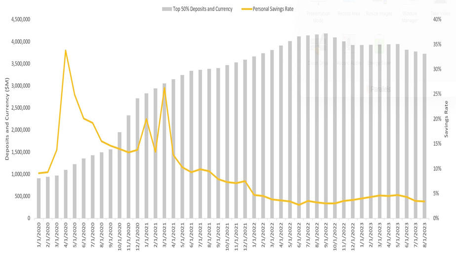
On January 22, I posted an article on consumer financial strength driven by the amount of cash consumers have in checkable deposits as reported by the Fed. If you look at the bottom 50% of households by wealth, they are sitting on an astounding 2.5x as much cash in their checking accounts as they had before the start of COVID. See the chart below.

Salvatore Tirabassi

You can see that the amount of cash peaked in September 2022 and has since been declining. The rate of decline though indicates that it will be some time before consumers get back to pre-COVID cash levels.

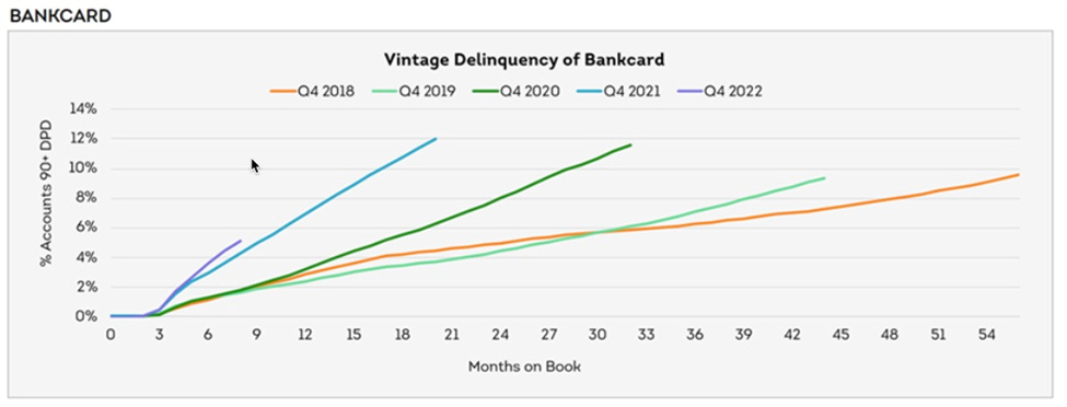
In January, Transunion reported that more recently issued credit cards are reaching high delinquency rates much earlier than expected. If you are new to consumer finance, we look at how credit performs from the date of issuance (also called a vintage) and that gives you the ability to compare how different issuance dates perform against each other.

Issuance dates closer to hard financial times should underperform the preceding issuance dates.

Let’s look at the Transunion delinquency chart.

Salvatore Tirabassi

This chart shows the percentage of credit cards (as a pool) issued in Q4 of each of the last 5 years to reach 90+ days delinquency (no payments in the last 90+ days). Each recent vintage pool has reached the level of delinquency of the previous vintage pool in a shorter period of time. For example, the orange line (Q4 2018 vintage pool) took 54 months to reach a delinquency rate of about 10%. Now look at the light blue line (Q4 2021 vintage pool). It took only 15 months to reach 10% delinquency. The most recent issuance date, the purple line (Q4 2022 vintage pool), is already at a faster pace than all previous vintage pools. Notice it is steeper than the light blue line that preceded it in Q4 2021.

If consumers are sitting on so much cash, why are credit cards going delinquent at a quickening rate?

There are many factors that could be at play here. Here are some of the drivers that I think are important.

  • The cash balances above reflect the bottom 50% of households, as a group. Hidden in that data are the stratifications of cash by household wealth, which would likely show lower cash savings as you move down to less wealthy households.

  • Similarly, the Transunion data above also groups all credit risk stratifications together. In a stratified view by credit risk wealth tier, you would likely see that the rates and pacing of delinquency will be higher and faster for lower-credit consumers.

  • The positive effects of COVID economics (higher wages, stimulus, new credit availability, savings from stay-at-home orders) are unwinding more quickly for the lower credit consumers.

This part of the market had the opportunity to spend more and put more on credit during COVID, and the banks were eager to bring new credit card accounts on. As the economy has gone back to normal over the last 24 months, these consumers have more regular demands on their cash, which took a backseat during COVID. Moreover, they now have credit card bills to address, which carry interest rates at the highest rates we have seen in years. The combination leads to increasing delinquencies, even though cash looks abundant.

 Reference: https://salvatoretirabassi.substack.com/p/cracks-in-consumer-credit-card-delinquency

Tuesday, February 6, 2024

Consumer Credit Card Interest Savings in a Decreasing Rate Environment

The stock market took some swings last week. It was down hard on January 31st on fears of no rate relief from the Fed and then rebounded firmly the very next day. An emotional roller coaster for many, to be sure. In this post, I am going to look at the upcoming rate environment but focus in on consumer debt and the potential savings consumers will experience as rates decline.

While the stock market will fluctuate wildly based on changing sentiments about interest rates over the course of 2024, consumer borrowers will be affected in a direct and consistent way because most consumer debt products are pegged to the Fed Funds rate. I am not going to focus on mortgages because much of the consumer housing market is carrying historically low rates into this environment already. As a result, decreasing rates will benefit new borrowers, not those who closed or refinanced their mortgages before 2022, which represents most mortgage holders in the US. Instead, I want to focus on total consumer debt and the fluctuating interest rates in credit cards which have rates priced as a function of the Prime Rate, which is a function of the Fed Funds rate.

The Fed has pointed to as many as three rate cuts of 25 basis points each. With the Fed Funds rate at 5.5%, this would bring down the rate to 4.75% at some point during 2024. The CME’s (Chicago Mercantile Exchange’s) Fedwatch indicator points to six cuts of 25 basis points during 2024 – 1.5% in total. This would bring the rate down to 4%. Bookending the two estimates, the Fed Funds rate will end up somewhere between 4% and 4.75% barring any unforeseen events that could change that.

Where the Fed ends up, will depend partially on the strong wage growth due to the low unemployment rate which is currently 3.7%, putting it below 4.0% for 23 months in a row. Because unemployment has been sustainably low, wages have benefited and real disposable income on a per capita basis has increased 3.7% year-over-year, which is much, much higher than the 1.7% averaged before the previous nine recessions since 1959. With that said, inflation has come into a more manageable range for the Fed, so the strength of the consumer, in my view, is less likely to cause inflation to rebound and is more important in avoiding a recession.

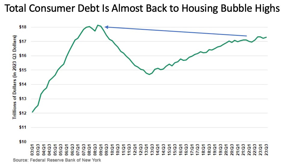
Now, with respect to consumer disposable income, interest expense has taken a some of the positive gains in wages. The chart below shows how total consumer debt has grown through Q3 of 2023. Total consumer debt in the United States is approaching levels not seen since the housing bubble highs before the 2008 crisis.

However, debt service remains well below the highs. This was caused by the massive deleveraging after 2008, where many debts carried high interest rates, and then re-leveraging into a low-rate environment that was sustained by the housing recession and then by the COVID actions taken by the Fed. So overall consumers have borrowed consistently since 2013 at very low rates, which fuels their ability to spend. You can see in the chart below, that during COVID (the absolute bottom of the line chart) debt service reached an impressive low point but even with the rebound in interest payments caused by all the recent Fed increases, debt service payments are still at a relative low point. In fact, debt service as a percentage of disposable income as of the middle of 2023 was lower than any time since 1981, excluding the pandemic period.

While the information above is about 3-9 months old (the Fed is slow with its data), the charts probably have not moved materially since they were published, in my opinion. So, taken at face value, decreasing interest rates in 2024, will significantly help the consumer.

Right now, US consumers are at near all-time lows in debt service with the highest interest rates highs that they have seen in 17 years. However, US consumers are reaching their highest accumulated debt in 17 years. Thanks to historically low rates, the US consumers have locked in super low mortgage rates, which are predominantly fixed rates and has allowed these seemingly contradictory facts to co-exist.

Back to credit cards. The variable debts US consumers hold in credit cards are what will drive interest expense fluctuations, and much of the increases in debt service are related to rising credit card interest rates. In fact, since the Fed started raising interest rates, credit card average interest rates have risen from 15% to 21.5%. This trend will reverse with the Fed rate cuts and US consumers will feel less payment pressure on credit cards. We can see credit card interest rates reverse to below 20% in the foreseeable future – still high but providing immediate savings to consumers.

I estimate that the savings in interest they might experience should range between $100 to $200 per household per year. This can continue to grow if rates decline further in the future.  $100-$200 per household per year may not sound like a lot. But if you put in the context of spending events, it becomes more meaningful. For example, it’s a few extra dinners out for the average American household that they previously couldn’t afford.

Reference: https://shorturl.at/uADX4


Monday, February 5, 2024

Decoding Consumer Balance Sheets: A Deeper Dive Beyond Savings Rates


Navigating the landscape of consumer finance, especially in the realm of excessive debt, prompts questions about the financial robustness of consumers and its potential impact on economic trends. In the post-COVID era, media discussions often revolve around the consumer savings rate, a metric influenced by stimulus measures and changing consumption patterns. However, a recent revelation, supported by alternative data points, challenges conventional perspectives on consumer finances. This analysis delves into the nuances of consumer balance sheets, exploring the interplay between savings rates and the substantial cash build-up in checking accounts.

Alternative Data Insights:

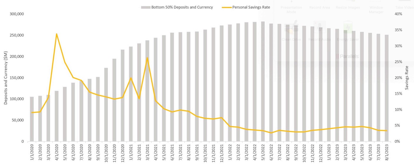
While the savings rate serves as a valuable indicator, it falls short in revealing the depth of cash accumulation. Contrary to widely reported savings rates, a closer look at the Federal Reserve’s Currency and Checkable Deposits data uncovers a more robust and sustainable financial position for the average US consumer. Comparing the cash availability evolution for the Bottom 50% and Top 50% of households reveals a significant uptick, with the former experiencing a 2.5x increase since January 2020 and the latter boasting a more substantial 3.5x surge.

Savings Rate vs. Currency and Checkable Deposits Bottom 50% of US Households

Charting the Course:

The provided charts depict the evolution of Currency and Checkable Deposits for both household groups. Notably, both segments began utilizing their accumulated cash, with the Bottom 50% initiating consumption in June 2022 and the Top 50% following suit in October 2022.

Average Consumer Balance Sheets:

Analyzing these data points underscores the resilience of the average US consumer balance sheets, with ample cash reserves and a prolonged trajectory before returning to pre-COVID levels. However, the sustainability of these balances varies by wealth decile, with wealthier households demonstrating a more protracted cash preservation period.

Erosion of Cash and Wealth Disparities:

It is crucial to acknowledge that these observations represent averages across all households, and the erosion of cash will likely manifest from the bottom up. The bottom 50% has already experienced negative growth, contrasting with the top 50%, signaling potential disparities in the impact of economic shifts. Less affluent households may face recessionary pressures while the broader economy remains relatively stable.

Forecasting Economic Trends:

While consumer balance sheets are not projected to be a significant driver of economic slowdown in the short term, factors like hiring trends, wages relative to inflation, and industrial output are expected to play more substantial roles in shaping the economic landscape. The intricate dynamics of wealth distribution and consumer behavior necessitate a comprehensive understanding for accurate forecasting of a recession or a “soft landing” scenario in the coming years.

Reference: https://tirabassi.com/

Sunday, February 4, 2024

Unlocking Synergies: Elevating Data Science with Operations Research Expertise

 **Introduction:**

Who’s on a quest to develop advanced data science capabilities? One of my analytics team’s strategic expansion brought together diverse talents in statistics, applied math, and engineering. This case study explores the integration of operations research, fostering collaboration and knowledge diversity within analytics.

**Objective:**

Our primary goal was to blend diverse skill sets, creating an environment conducive to innovative problem-solving. While the envisioned integration remained a future prospect, immediate focus shifted to operations research for its promising prescriptive capabilities. 

**Operations Research Focus:**

Econometrics was another area if interest for time-series analytics, but operations research, tailored for data science programming and extensive datasets, emerged as a focal point. Excelling in solving objectives within specified constraints, it offered optimal solutions that set it apart from traditional machine learning models.

**Prescriptive Analytics vs. Predictive Analytics:**

Distinguish prescriptive analytics (operations research) from predictive analytics (machine learning). The former provides optimal solutions based on defined constraints, while the latter predicts outcomes based on historical data.

**Transportation Example:**

In a transportation scenario, predictive models analyze historical data for efficient routes. Operations research, however, prescriptively determines the least-cost path based on constraints, suggesting routes not traveled before. One other aspect of operations research and linear programming models is that they also handle revenue and expense variables quite well.

**Methodology and Insight:**

While both approaches may lead to similar conclusions, their methodologies diverge significantly. Predictive models embrace uncertainty, offering likely outcomes, while operations research precisely calculates optimal solutions, evaluating all possible choices.

**Data Science Synergy:**

Understanding this nuanced difference empowers an analyst or data scientist to approach problem-solving flexibly. Predictive models shine in uncertainty, providing choices based on learned experiences. Operations research excels with known inputs and complex combinations, delivering reliable solutions.

**Conclusion and Future Prospects:**

This case study illuminates the ongoing journey in cultivating a collaborative data science environment. As the capabilities of a team evolve, the prospect of adding talents like the previously mentioned econometrics, which excels in time-series forecasting, holds the promise of elevating capabilities to tackle even more complex challenges. Unleash the potential of data science synergy with operations research expertise! 

 🌐📈 #DataScience #OperationsResearch #AnalyticsSynergy #PrescriptiveAnalytics #PredictiveAnalytics #CaseStudy

 Reference:- http://tirabassi.com/

Wednesday, January 31, 2024

An AI Crystal Ball? How We Predict Future Outcomes Using a Temporal Fusion Transformer Model

Salvatore Tirabassi
Our data science and analytics teams handle and apply lots of data for insightful decision-making. Last year, I presented the data science team with a challenge: use historical data to predict a key business driver for each of the next 8 periods. We wanted to have a data-driven preview of what we might see in the in each of the next eight periods so that we could anticipate the actual outcome and make better decisions with a an eight-period.

The data science team went to work researching ways we could do this and tested a few different methodologies. We have lots of input data from our own and public sources to feed any model we wanted to test, which worked well for us. With that said, we had low expectations about finding a predictive model that produced anything reliable.

Testing different algorithms is always our approach. For the semi-technical readers, before settling on Temporal Fusion Transformer (TFT), the algorithms we tested included ARIMA, VAR, GARCH, ARCH models (univariate), Prophet, NHits, and Nbeats. TFT is an attention-based deep learning neural network algorithm. Using a mix of inputs, it produces a forecast over multiple periods in a future time horizon that you can determine. You can predict days, weeks, months quarters (really any interval is possible) into the future. Your choice.

The picture below shows the concept of how TFT works.

Salvatore Tirabassi

Source: Bryan Lim, Sercan Ö. Arık, Nicolas Loeff, Tomas Pfister. “Temporal Fusion Transformers for interpretable multi-horizon time series forecasting.” International Journal of Forecasting. Volume 37, Issue 4, October–December 2021, Pages 1748-1764.

A continuous improvement process best describes how we developed and continue to refine the model. It’s a never ending process of improvement, as a true crystal ball is never achieved.

These are the four stages of development we went through after choosing TFT as our algorithm:

  • Stage 1a: Selecting all logical observed inputs and test how they drive the model. We started with over 100 and the final model only used 20. Go to Stage 1b as needed.
  • Stage 1b: Refining the time intervals of the observed inputs. Since the inputs might come in varying time intervals (daily, weekly, monthly and quarterly, etc…), we needed to find methods to standardize them. You should choose an interval that matches the decision-making forecast you are producing, if you can. Go back to Stage 1a as needed.
  • Stage 2: Model iteration and improvement. Complete back testing. Examine early predictions. Go back to Stages 1a and 1b as needed. At this point, you have probably settled on one or two of the most promising algorithms.
  • Stage 3: Begin using in production and comparing predictions to the future periods as they unfold. Learn and refine by going back to any previous stage as needed.
  • Stage 4. Continuous improvement loop. Write long-term road map. Test new inputs as they are presented. Continuous scrutiny of the predictions against what actually happens – learn and make changes by going back to any previous stage as needed.

Note that at any of the stages of development, you can use a TFT encoder decoder to measure the importance of different inputs in the algorithm to learn which ones have the most impact on your prediction.

Below are the results of our model. The orange line is the actual result of the key driver and the blue line is the prediction of the key driver that was made 8 periods ago. The area to the right without the orange line is the next 8-period forecast. So, at Period 19, we can use the blue line forecast to take action based on what Periods 20-27 tell us. When we reach Period 20, we evaluate the updated forecast and we make a decisions accordingly for the future periods. This way, we have a rolling 8-period prediction/decision cycle.

Salvatore Tirabassi

As you can see the model has been refined to a level that it makes useful predictions and handles volatility of the prediction with some reliability. Right now, we don’t use this to predict the future down to the exact number, which would be ideal, but we use it for a directional understanding of where things are headed so we can make better decisions at the current decision point.

Recurring Revenue Modeling Can Be Tricky, Using Cancellation Curves Can Improve Precision And Results

  In a recent post on recurring revenue financial modeling, I covered some of the main drivers that play a role in the construction of finan...